
The Coalition design system
I led the creation of The Coalition design system for web team. This system follows standard quality and design requirements and is designed to be reusable, scalable, and shareable among teams, while also adhering to Microsoft Content Accessibility standards. By using this design system, The Coalition web team are able to ship MVP features faster and increase design efficiency as video game websites evolve. My web style guidelines are shared among various departments including Engineers, QA, Esports, Partners, and Product Managers.
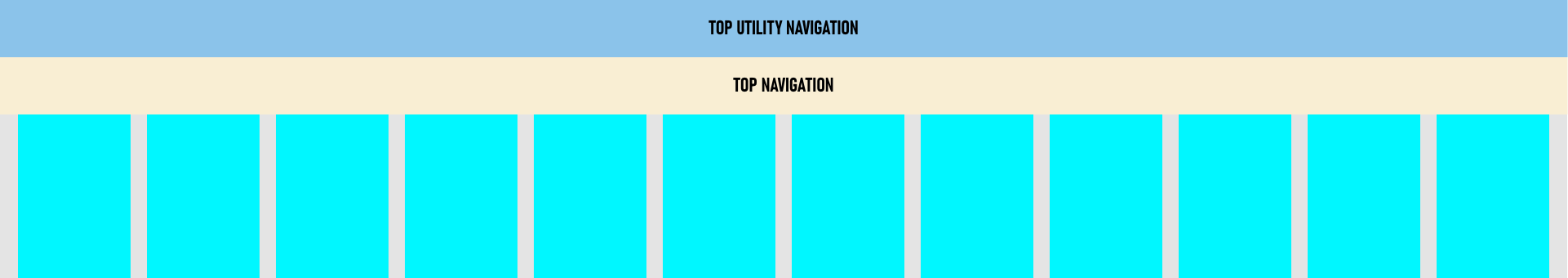
Grid
Desktop 1920 x 1080 breakpoint.
- Columns: 12
- Gutter width: 20
- Column width: 138
- Left and right margins: 122
Tablet 768 x 1024 breakpoint.
- Columns: 8
- Gutter width: 14
- Column width: 80
- Left and right margins: 15
Mobile 414 x 736 breakpoint.
- Columns: 6
- Gutter width: 20
- Column width: 138
- Left and right margins: 122
Typography
I provided the right CSS font size to developers and space the text accordingly so that it’s easy to read in different languages.
Gears franchise, Gears5, and Gears Esports typeface: Bahnschrift
Desktop scale converted to em.
- body { font-size: 18px; }
- h1 { font-size: 4.77em; line-height: 1.1; } /*86/18*/
- h2 { font-size: 3.33em; line-height: 1.2; } /*60/18*/
- h3 { font-size: 1.77em; line-height: 1.3; } /*32/18*/
- h4 { font-size: 1.33em; line-height: 1.5; } /*24/18*/
- p { font-size: 1em; line-height: 1.5; } /*18/18*/
Mobile scale converted to em.
- body { font-size: 16px; }
- h1 { font-size: 3.125em; line-height: 1.1; } /*50/16*/
- h2 { font-size: 2.5em; line-height: 1.2; } /*40/16*/
- h3 { font-size: 1.5em; line-height: 1.5; } /*24/16*/
- h4 { font-size: 1.125em; line-height: 1.5; } /*18/16*/
- p { font-size: 1em; line-height: 1.5; } /*16/16*/
Gears Tactics typeface: Industry
Desktop scale converted to em.
- body { font-size: 18px; }
- h1 { font-size: 3.33em; line-height: 1.1; } /*60/18*/
- h2 { font-size: 2.22em; line-height: 1.2; } /*40/18*/
- h3 { font-size: 1.66em; line-height: 1.2; } /*30/18*/
- h4 { font-size: 1.11em; line-height: 1.5; } /*20/18*/
- h5 { font-size: 1em; line-height: 1.5; } /*18/18*/
- h6 { font-size: 0.88em; line-height: 1.6; } /*16/18*/
- p { font-size: 1em; line-height: 1.6; } /*18/18*/
Mobile scale converted to em.
- h1 { font-size: 2.5em; line-height: 1.1; } /*40/16*/
- h2 { font-size: 1.875em; line-height: 1.2; } /*30/16*/
- h3 { font-size: 1.25em; line-height: 1.4; } /*20/16*/
- h4 { font-size: 1.125em; line-height: 1.5; } /*18/16*/
- h5 { font-size: 1em; line-height: 1.5; } /*16/16*/
- h6 { font-size: 0.75em; line-height: 1.6; } /*12/16*/
- p { font-size: 1em; line-height: 1.6; } /*16/16*/
Gears POP! typefaces: Saira Condensed and Badaboom
Text
Where the breakpoint is one of
-
xs- set styles from0pxand up (phones) -
sm- set styles from and up (large phone) -
md- set styles from600pxand up (tablet) -
lg- set styles from958pxand up (desktop) -
xl- set styles from and up (large desktop)
Where alignment is one of:
- left
- right
- center
Iconography
Mobile icons
Opt for minimalistic user interfaces and interactions to avoid clutter, since about half of our users are viewing from a small screen on mobile. Web icons are simpler than the game's to keep it clean and distraction-free.
Icons are designed to be modern, simple, bold, and geometric to ensure clarity and readability at very small sizes. Stroke weight, shape, and corner radius must be consistent.
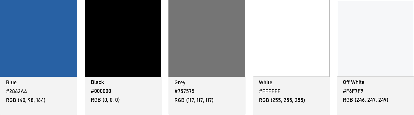
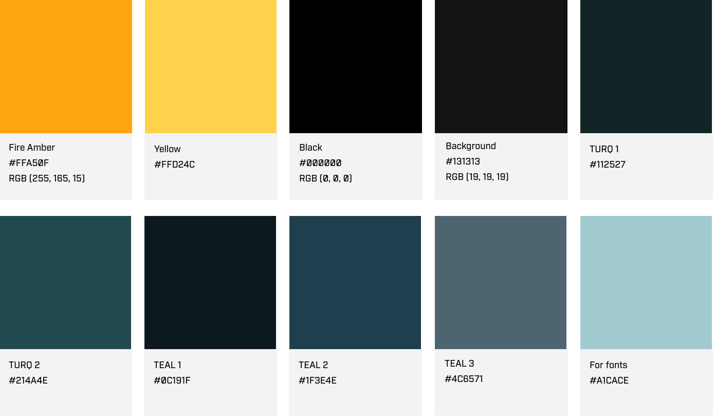
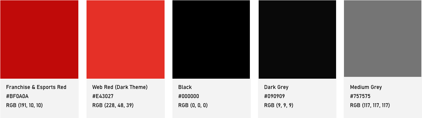
Colors
These colors are added to the asset panel in Adobe XD and can easily be changed to your custom brand colors. Color contrast ratio requires 4.5 and design must be AA compliant.
Gears 5 light theme
Gears Tactics dark theme
Gears franchise and Esports dark theme
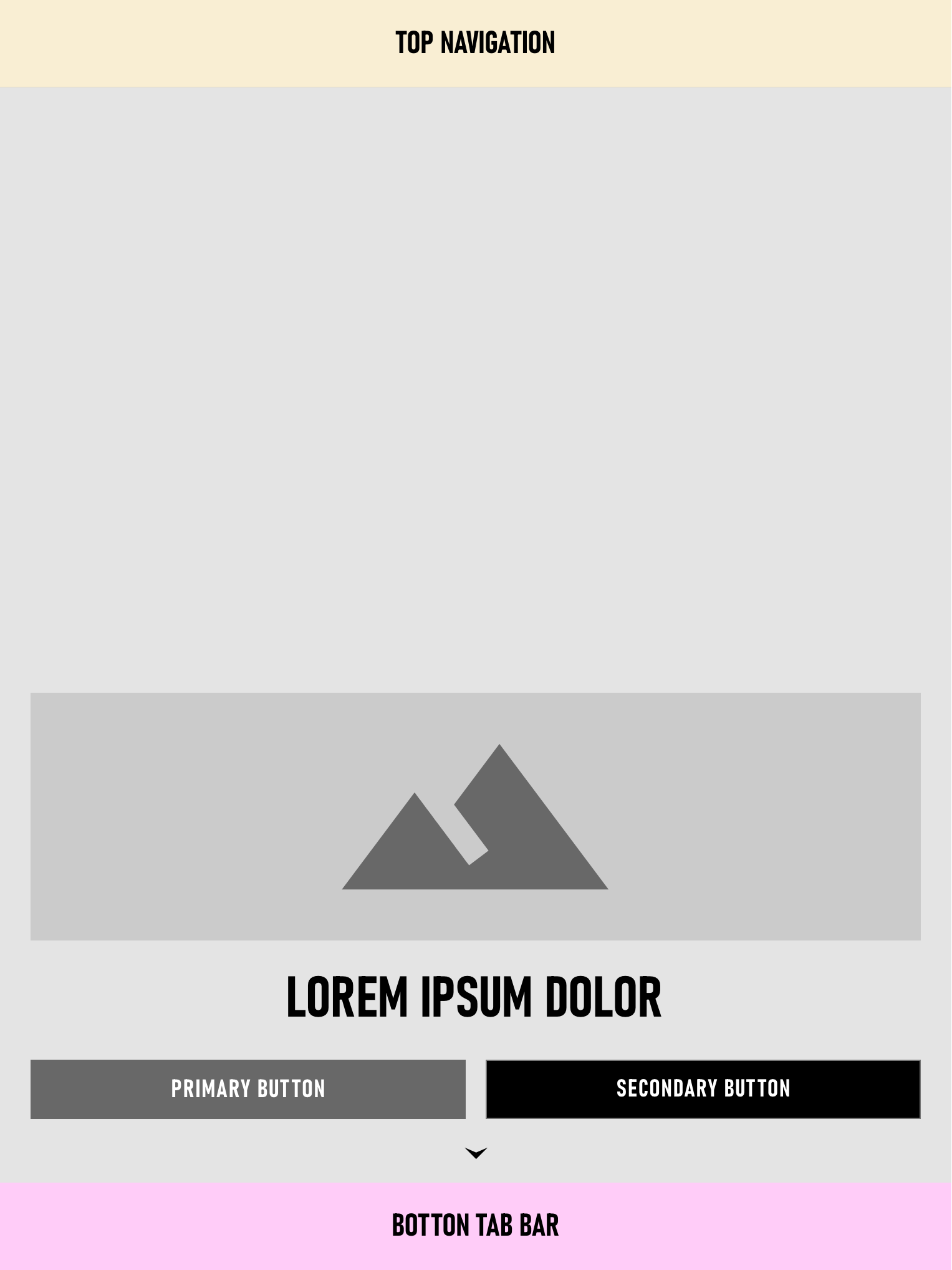
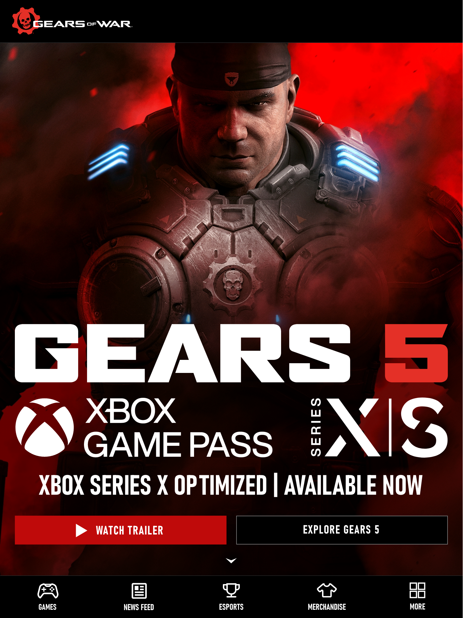
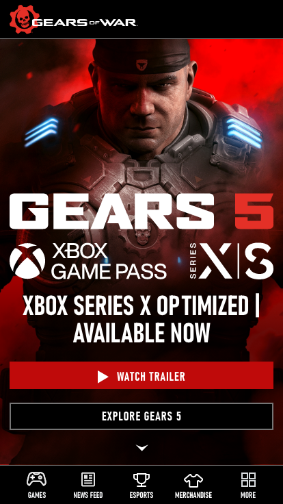
Hero
Desktop 16:9 aspect ratio images at least 2560 x 1440 pixels JPEG, 72 pixels/inch. 3840 x 2160 4K is nice to have. Still image and 15 second looping video on desktop.
Tablet and mobile 1:1 aspect ratio images 2000 x 2000 pixels JPEG, 72 pixels/inch (9:16 centered safe zone). Still image and no looping video on tablet and mobile.
Hero component
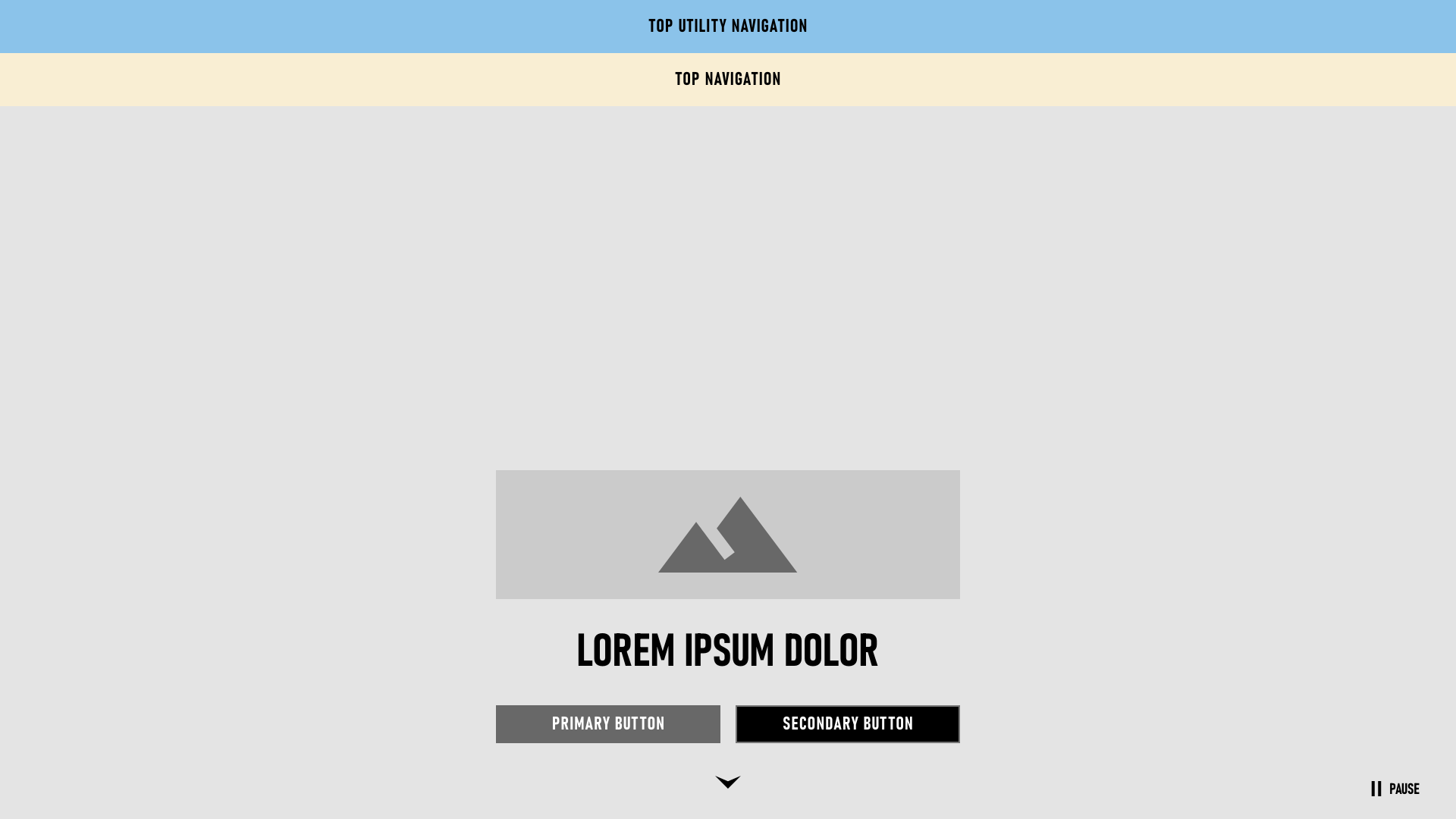
Gears franchise hero
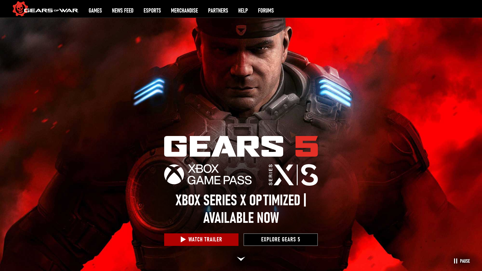
Copy
- Desktop line length of 75 character width.
- Try to limit paragraphs to five lines – not sentences. Two to three sentences is often enough.
- The headlines are to grab the reader instantly and the body towards readability.
Mobile controls
Native iOS and Android keyboard push assets differently. Use native mobile controls for web components, such as control pickers for ESRB (Entertainment Software Ratings Board) mature +17 age gate.
Touch targets
Use 45px touch target with minimum space between elements of 8px. This is about 48 x 48 decimal places (dp) or 44 x44 point conversions (pt) touch target.
Gestures
User interface and gestures satisfy both iOS and Android users. Using standard hand gestures, such as tap, drag, flick (scroll or pan), swipe, double tap, pinch, and touch and hold on the keyboard.
Action menu
Apply action menu triggers that slides up from the bottom. This interaction works similar to iOS human interface and Android material design.
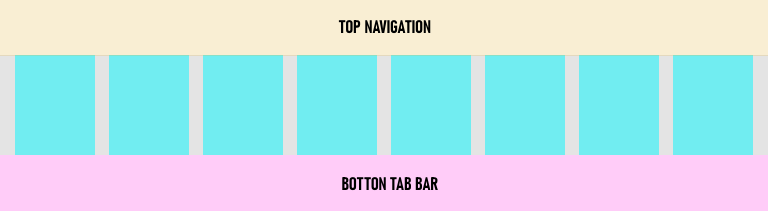
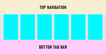
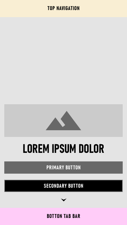
Tab bars
Fixed bottom tab bar displaying up to five tabs for global navigation. A More tab is used to display extra tabs and slides up a drawer when triggered. Tablet amd mobile screens tab bar consists of five icons maximum per row.
Buttons
Gears 5 light theme
Contained primary

Outlined secondary

Gears Tactics dark theme
Contained primary

Outlined secondary

Gears franchise and Esports dark theme
Contained primary

Outlined secondary

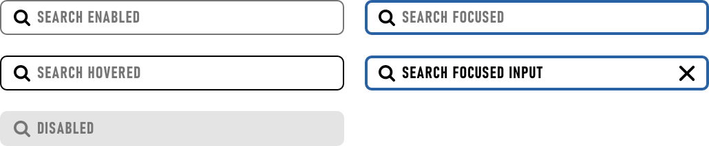
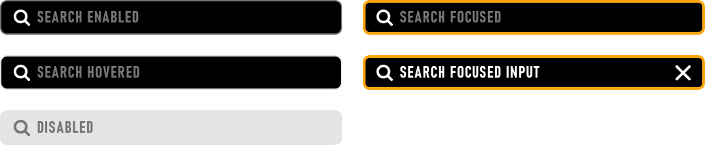
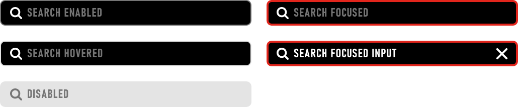
Search boxes
Gears 5 light theme
Gears Tactics dark theme
Gears franchise and Esports dark theme
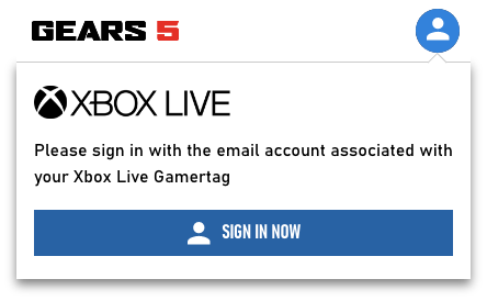
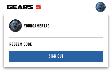
My Account
Mobile signed out
Mobile signed in
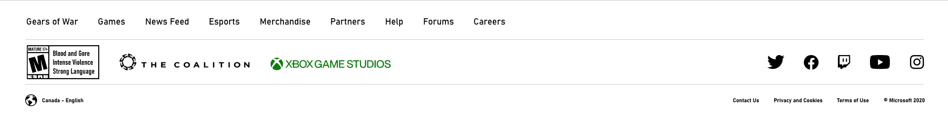
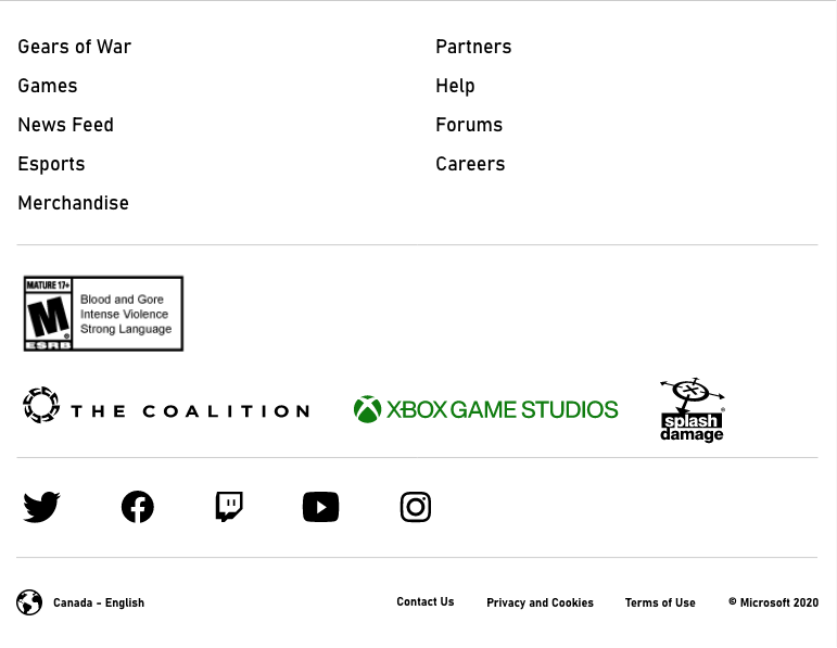
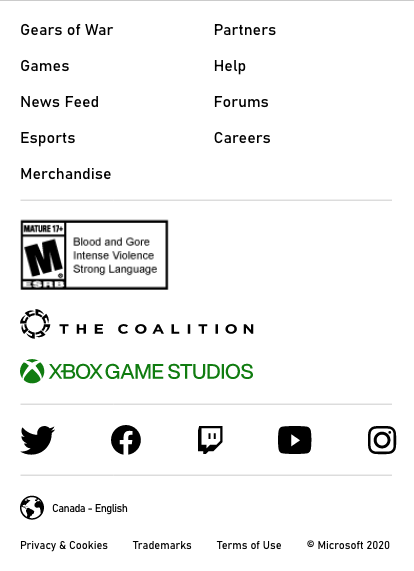
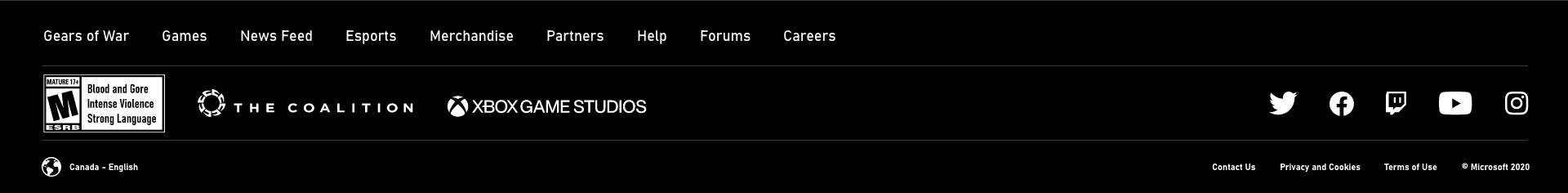
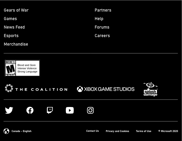
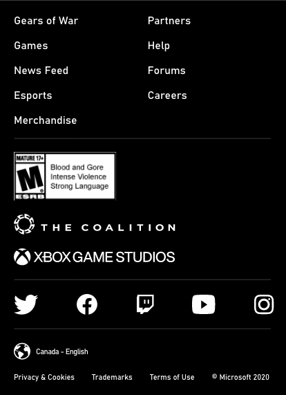
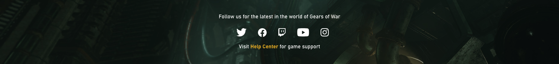
Footers
The Xbox brand logos utilize a bold, flat, 1-color design. Do not modify the Xbox logo. The logo is available in horizontal and stacked versions in either green or white. Do not make the logo black.
Desktop, tablet, and mobile light theme
Desktop, tablet, and mobile dark theme
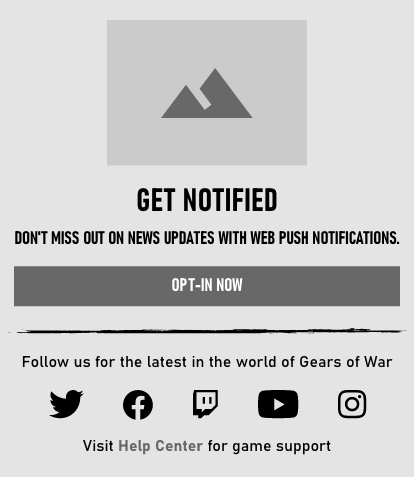
Notification banner
Display notification call-to-action banner at end of each news post. The action button goes to the Manage Notifications Settings page.
Opt-in component

GHide opt-in component


Gears 5 opt-in
Gears 5 hide opt-in

Gears Tactics opt-in
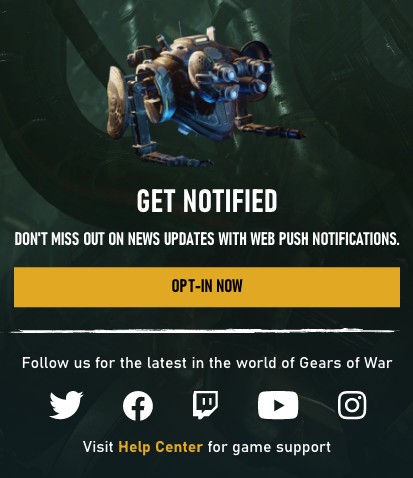
Gears Tactics hide opt-in

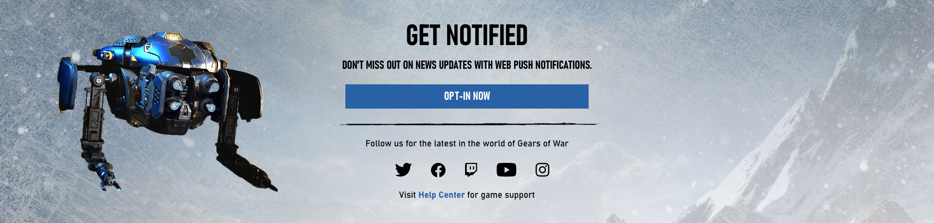
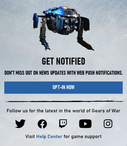
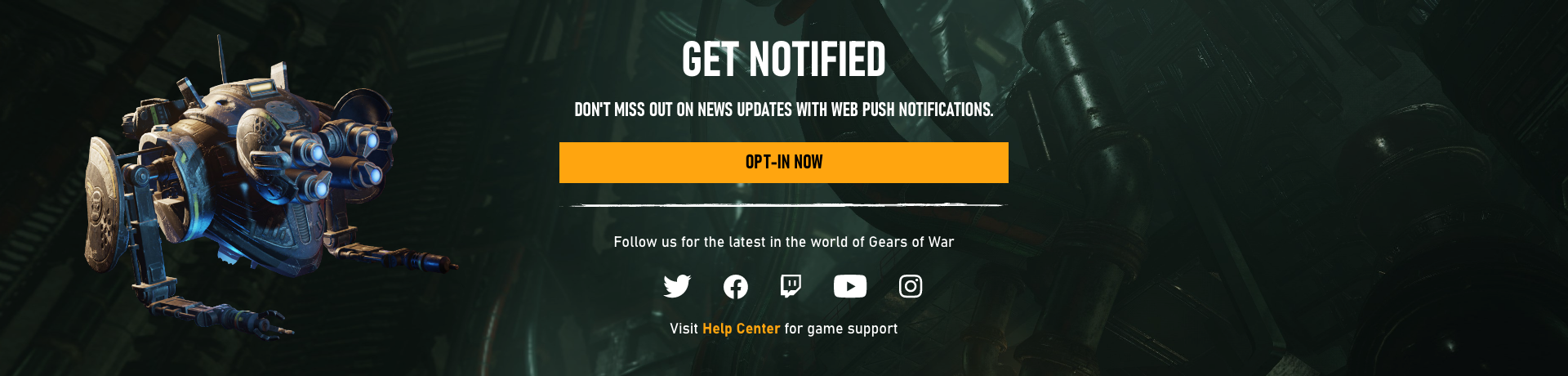
Push notification
Ensure web progressive enhancement functions work as designed especially for Chrome, Edge, and Safari browsers on iOS and Android devices. When designing a mobile-first, make sure that it feels like an iOS and Android app while using progressive web application push notifications.
Gears5.com, gearstactics.com, and gears.gg have push notifications for users to subscribe on most platforms and browsers. This engages our users without a native app and increases our traffic. Gears5.com push notifications were released in October 2020 and subscriptions have increased by 25% in December 2020.
If web push notifications are not supported, hide all notification features.
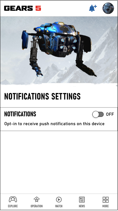
Push not subscribed
If not subscribed, display notification with plus icon and off switch toggle.
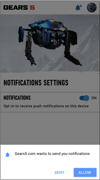
Permission prompt
Browser support notifications: Edge, Firefox, Chrome, Safari macOS, Opera, Android browser, and Opera mini.
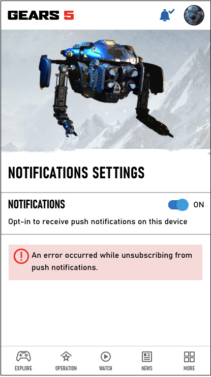
Push subscribed
If subscribed, display notification with checkmark icon and on switch toggle.
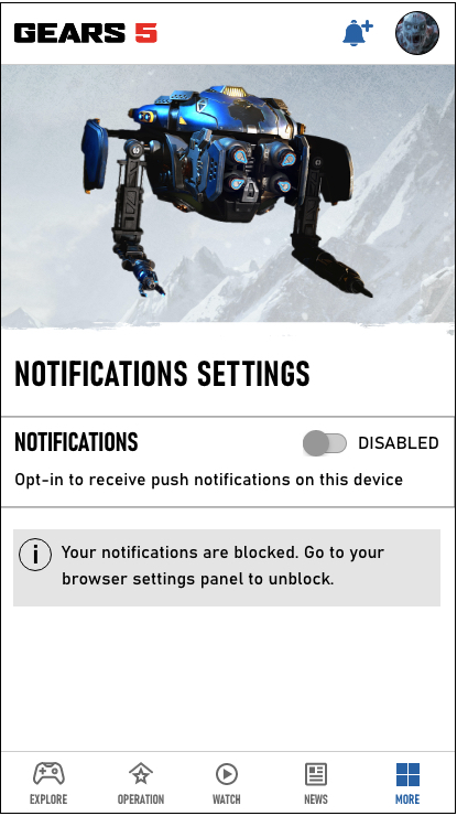
Disabled - block
Display disabled switch toggle. If the user clicks/taps the "Block" button in the permission prompt, the web app will not be able to ask the user for permission again. They will have to manually "unblock" the app by changing its permission state, which is buried in a settings panel.
Xbox banner
Xbox brand logos
- Xbox brand logos utilize a bold, flat, 1-color design.
- Do not modify the Xbox logo.
- The logo is available in horizontal and stacked versions in either green or white.
- Do not make the logo black.
- Xbox green HEX #107C10, RBG (16,124,16).
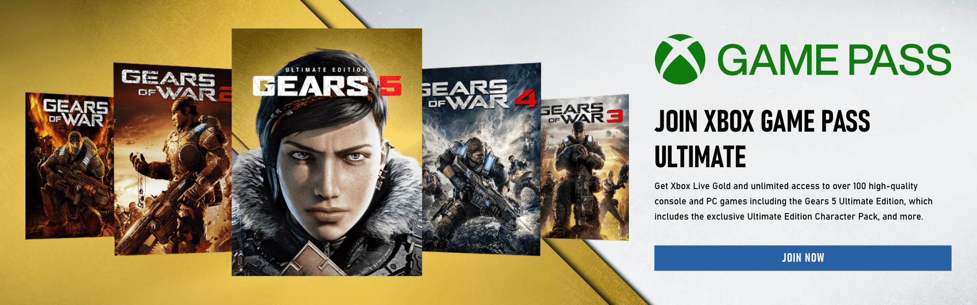
Xbox Game Pass digital button label options
Always provide an arial-label, such as "Join now, learn more about joining Xbox Game Pass Ultimate".
- "Join Now"
- "Buy Now"
- "Play with Game Pass"
- "Join Xbox Game Pass"
- "Get it Now"
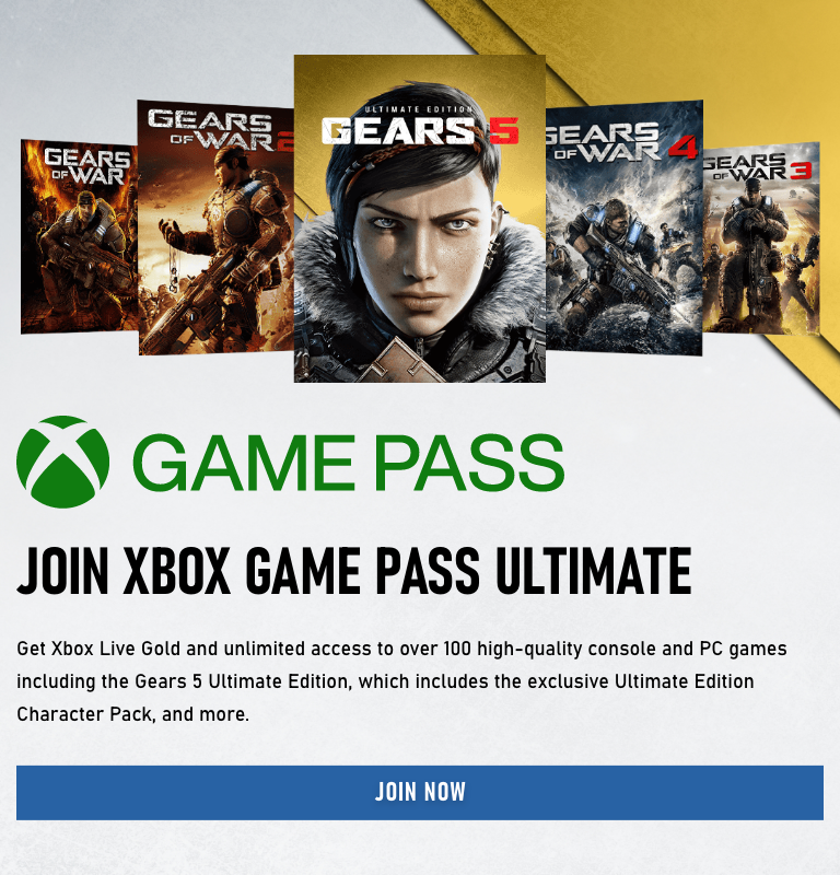
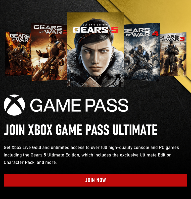
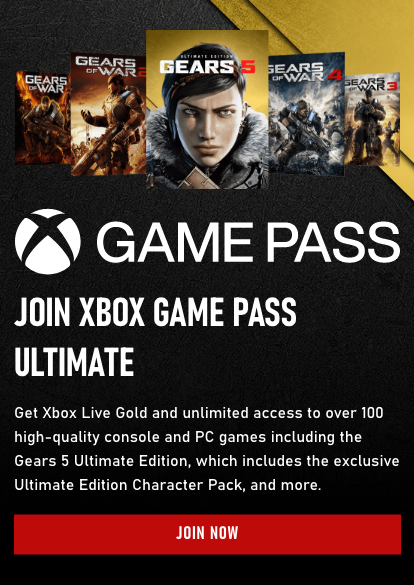
Desktop, tablet, and mobile join XGPU component
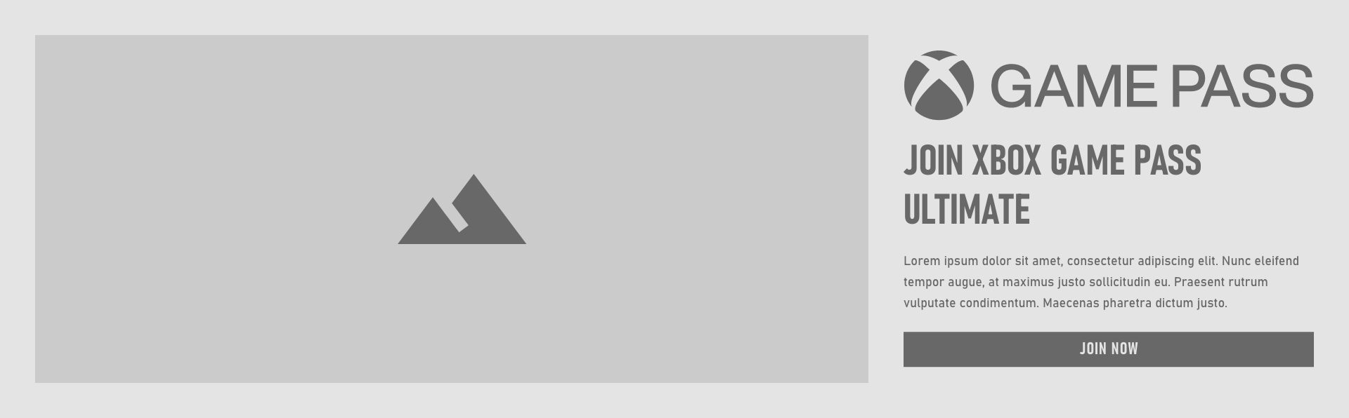
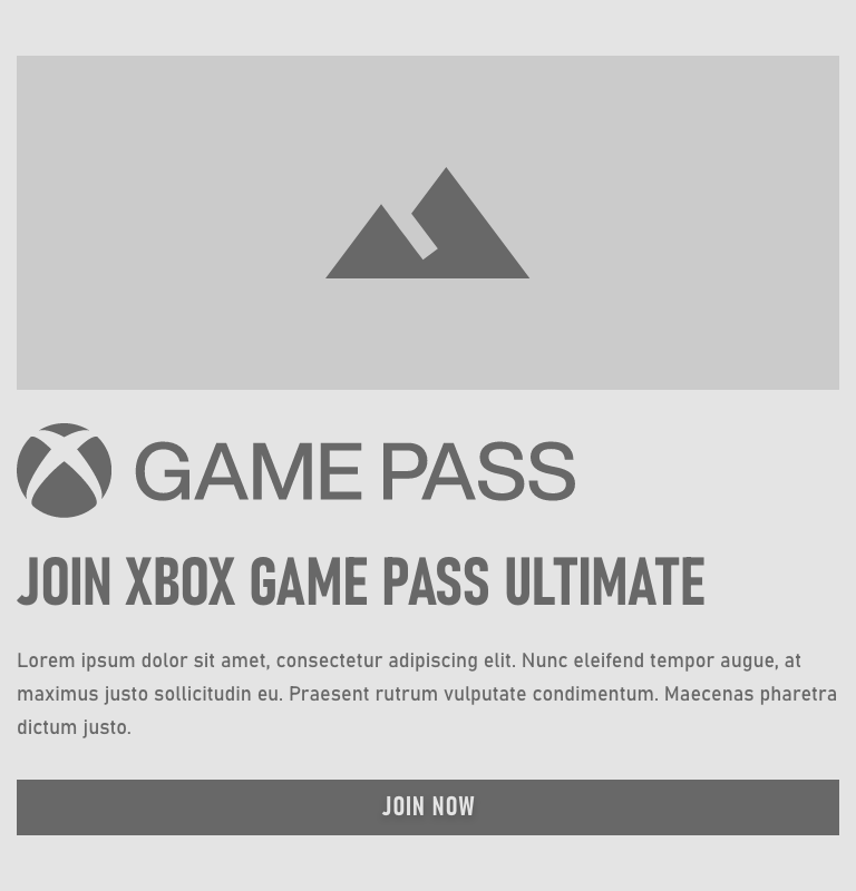
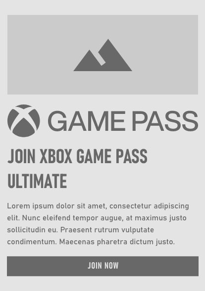
Desktop, tablet, and mobile join XGPU light theme

Desktop, tablet, and mobile join XGPU dark theme
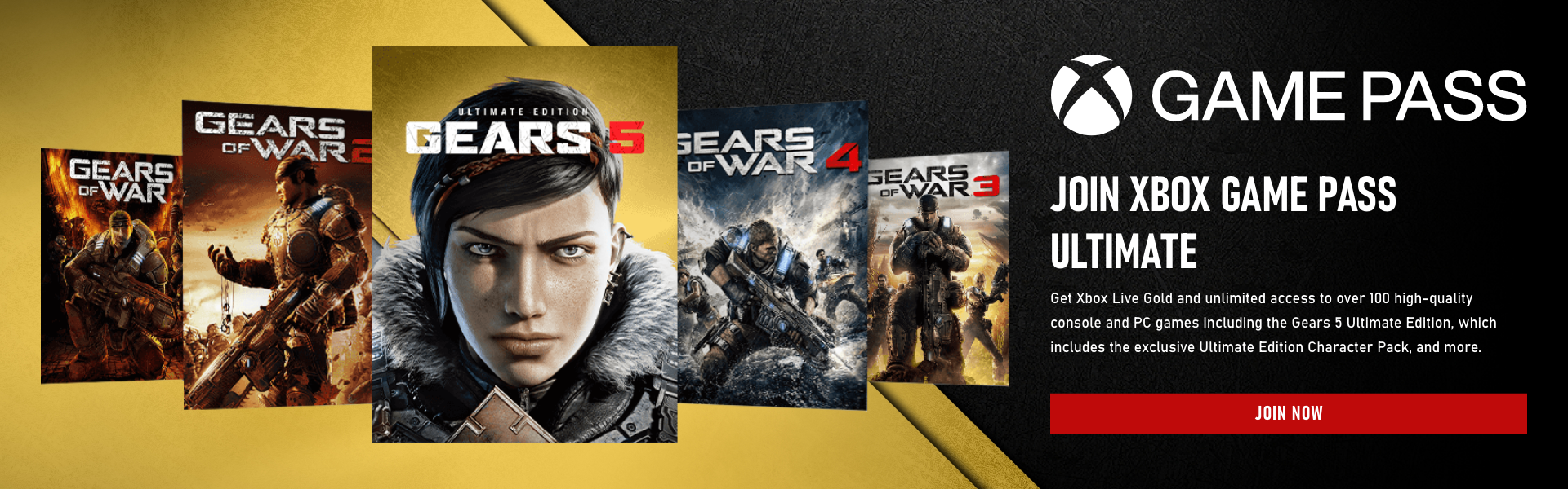
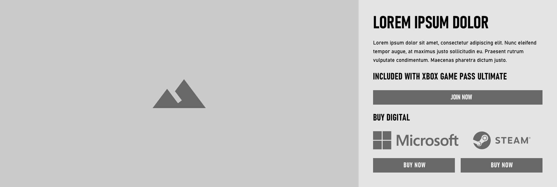
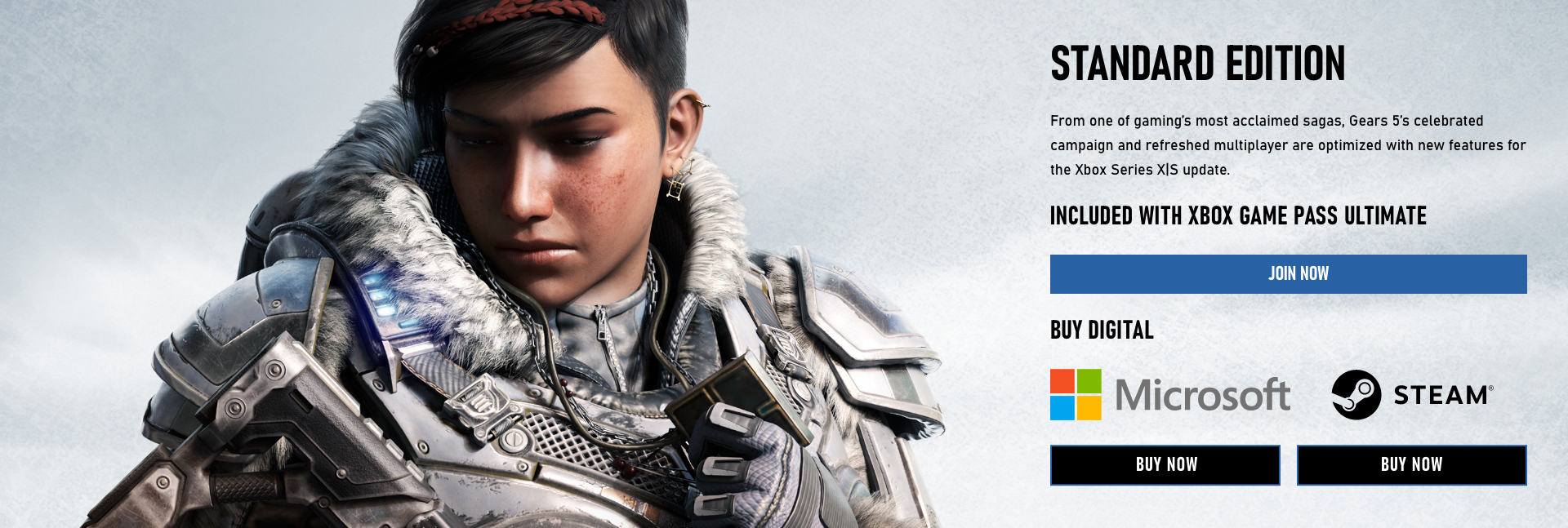
Desktop join XGPU or buy digital component
Covers
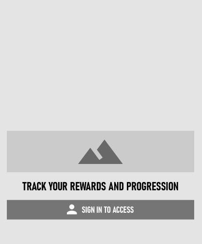
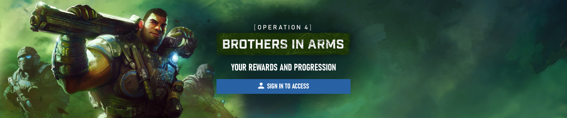
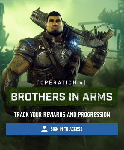
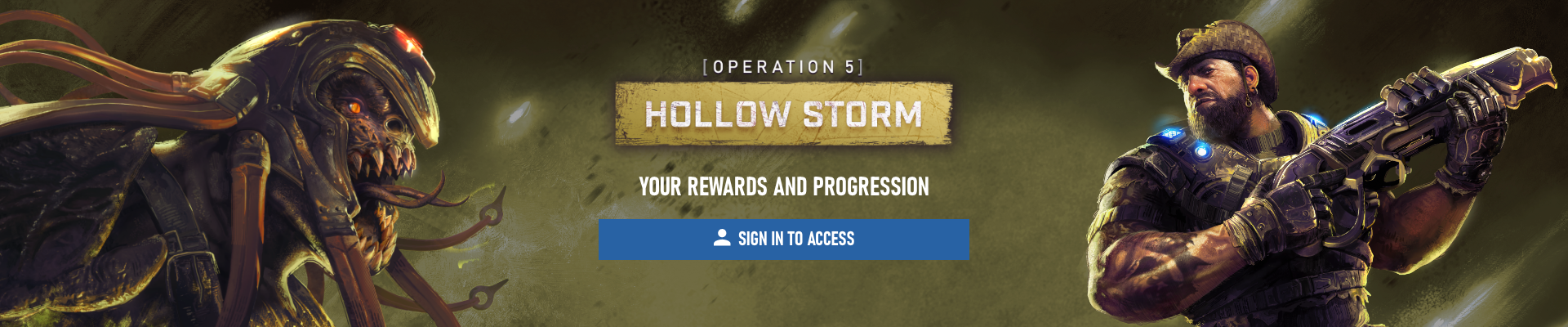
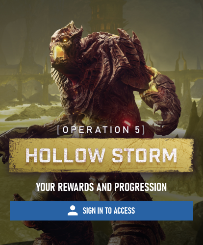
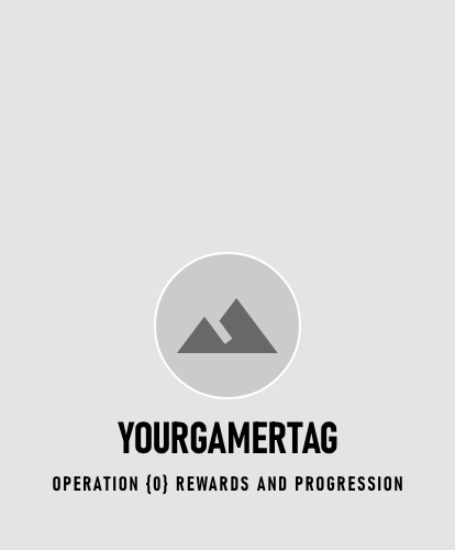
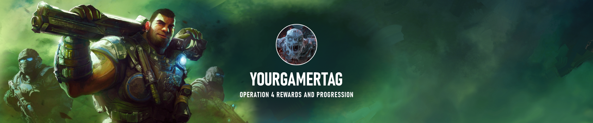
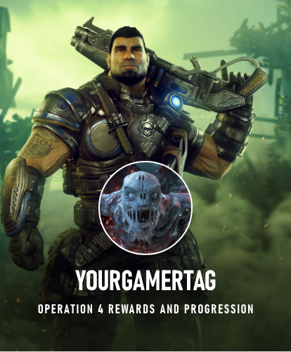
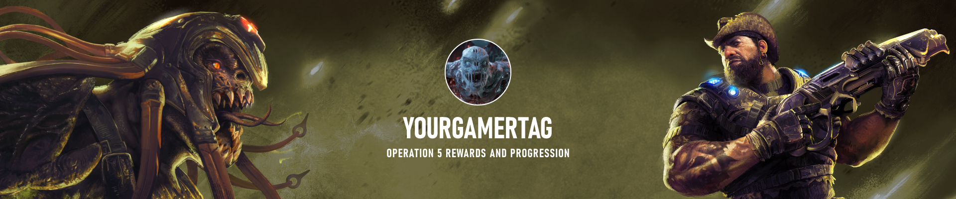
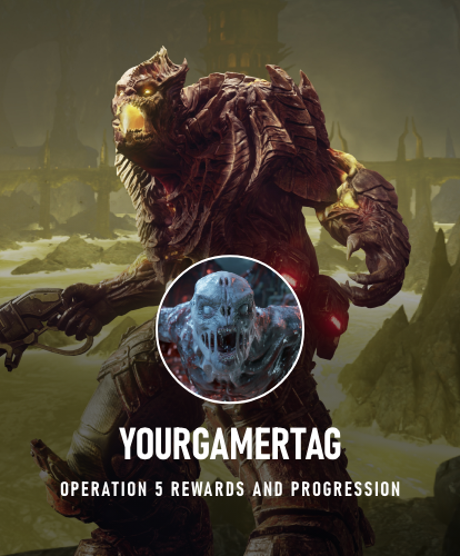
- Always display current Operation background image and lockup.
- 130 x 130 px XBL profile image, 2px solid border line #FFFFFF.
Desktop and mobile sign in to access Operation {0}

Desktop and mobile sign in to access Operation 4 and 5
Desktop and mobile signed in to Operation {0}

Desktop and mobile signed in to Operation 4 and 5
Next case study